
Color trends are constantly evolving. It can be hard to keep up! No sooner had Pantone announced the Color of the Year 2019 than they were releasing a whole new palette of colors that’ll turn heads in the fashion and design world. The dawn of a new season is always a great time to refresh your home with color. Here are our favorite spring color pairings from Pantone’s list. What are yours?
A Twist on Tradition
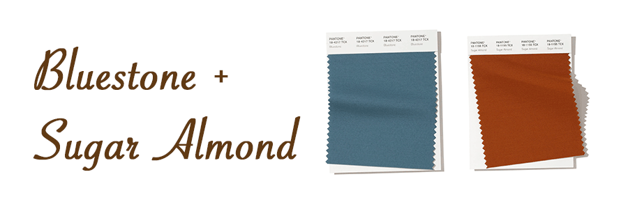
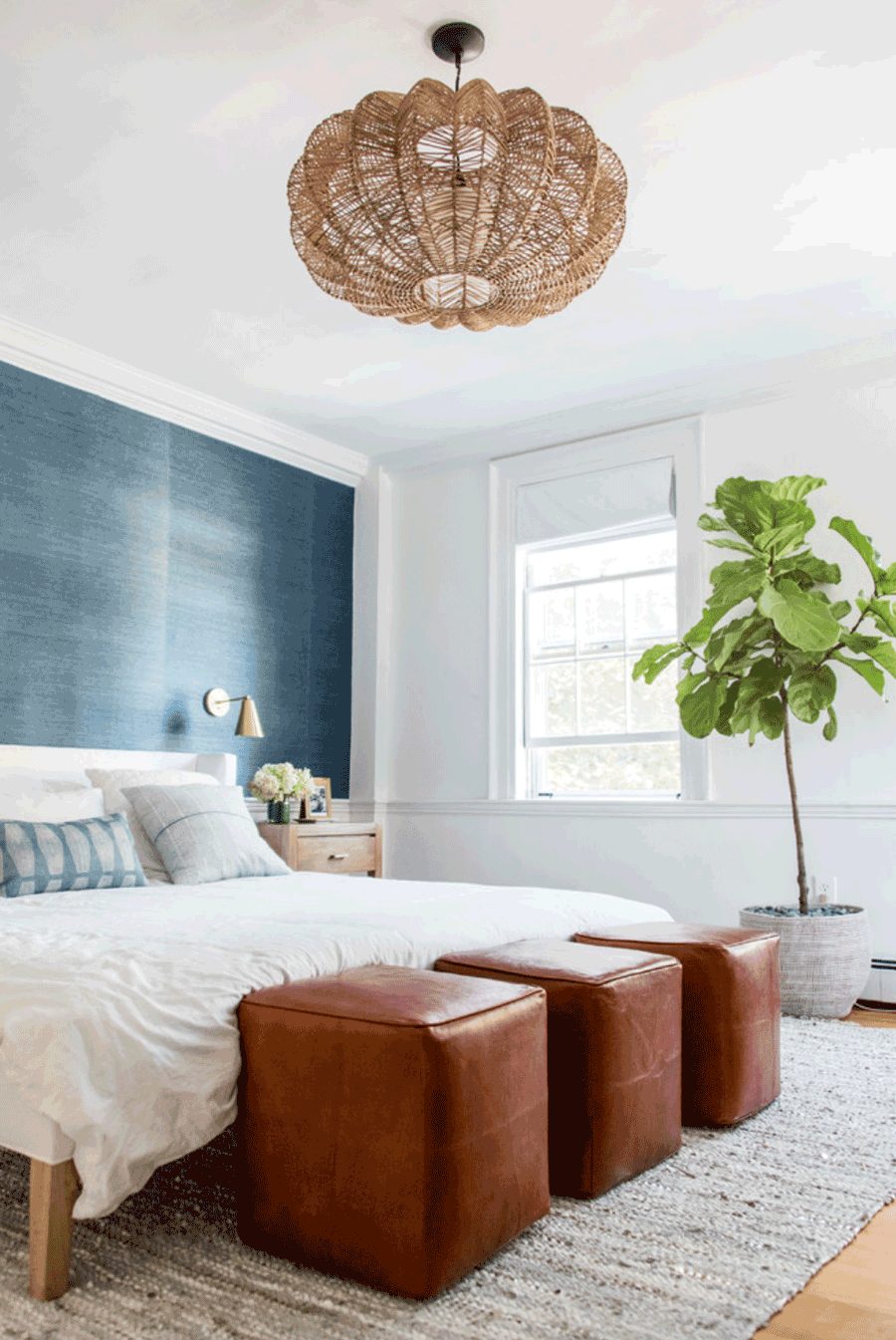
Classic color pairings marry hues from opposite sides of the color wheel. These appealing duos are always stylish and on-trend. Putting a modern spin on the traditional coupling of blue and orange, Bluestone and Sugar Almond are truly a match made in design heaven.
At Peace with Pastels
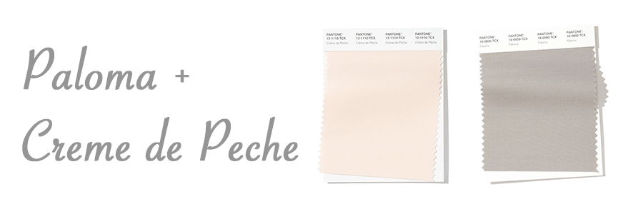
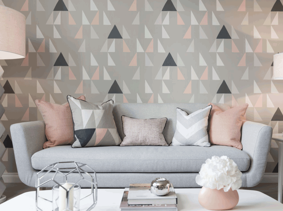
Any talk of spring color pairings just wouldn’t be complete without some soft pastels. These delicate tones are the epitome of spring and current go-tos in design. With the reigning white interiors look, pastels mix in gorgeously to add charm, personality, and coziness. We love the ease and elegance of Paloma and Crème de Pêche. Do you?
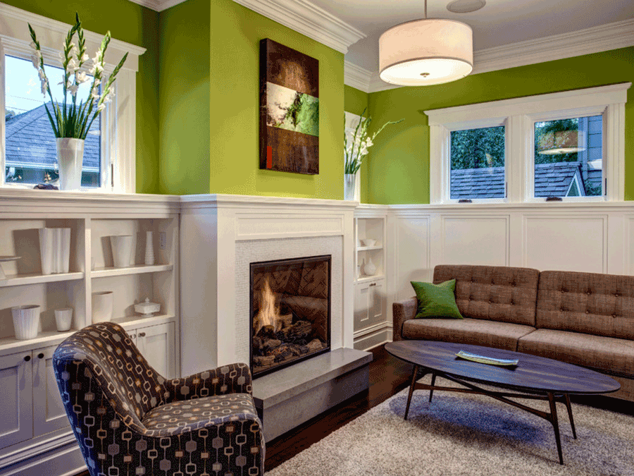
Fully Alive and Energized
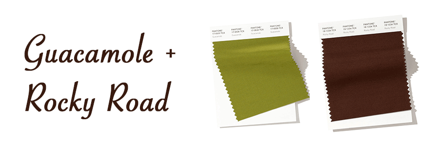
Perhaps you like to walk on the wild side. There are plenty of bold beauties set to grace the design scene with their zesty energy. For spring color pairings that bring serious drama and excitement, try two spirited hues together. If you’re looking for a bit more balance, then Guacamole and Rocky Road might just be your ideal match. Simultaneously livening and grounding, this color team embraces the design world’s continuing fascination with nature.
Inspired by This Years Spring Color Pairings?
From classic color combos to delicate pastel tones and powerful bold hues, this year’s spring color pairings are dynamic. Which ones speak to you? At California Window Fashions, we love to bring the latest trends to life in our clients’ homes. Our team can help you discover window treatment fabrics to fit your favorite color schemes and solutions for all the spring lighting issues that arise this time of year. Contact us today!