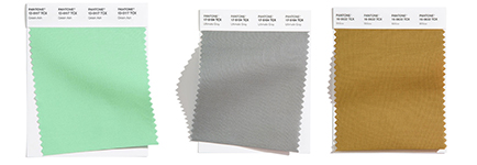
Do you ever find yourself scrolling through dreamy home photos? Us too! And this week we’re bringing you 2021’s new color trends so you can learn more about how to make some of those dreamy spaces a reality for yourself! Pantone’s top colors were just released for the year to come, and we dove in head-first to find the best pairings and combos for you. We have their top picks for both bolds and neutrals and can’t wait to introduce you to them. The palette definitely adds some extra happy and a feel good atmosphere to the spaces where it’s implemented, which we can all agree is key, especially after the year we’ve had.
The First of the Color Trends: Remain Calm
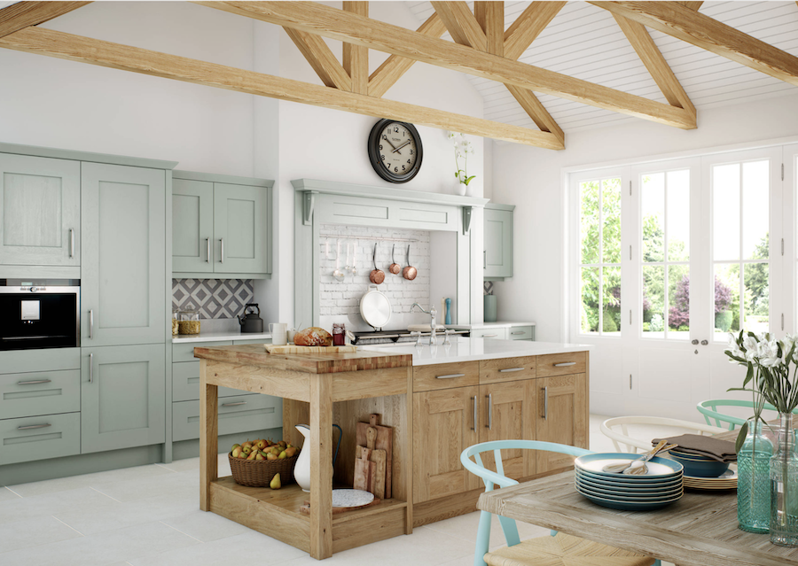
Your home should always feel like your dream oasis–having a relaxing atmosphere will help you to feel more at peace in your space. Calm doesn’t have to mean sticking to just neutrals, you can add the perfect color and still have a serene setting. This green looks stunning with the natural wood beams and the white walls in this kitchen. For years we have been seeing very neutral kitchens topping the charts. In the year to come we’re going to be seeing more and more painted cabinets in different hues.
No More Feeling Blue…It’s a Good Design Choice!
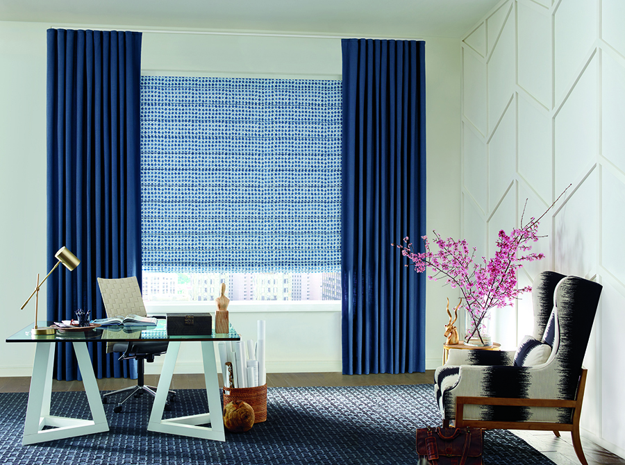
It seems like there is always a shade of blue on the color trends palette by Pantone… and for good reason! Blue can emulate so many different vibes. Between moody and fresh, there are tons of different shades perfect for nearly any room. Classic Blue is the color of the year for 2020 and back in 2016 was a softer blue that tied with a pink tone. And since there are TWO different blues in the top ten again this year, 2021 may also be featuring blue as the color of the year.

Go for that Accent Wall
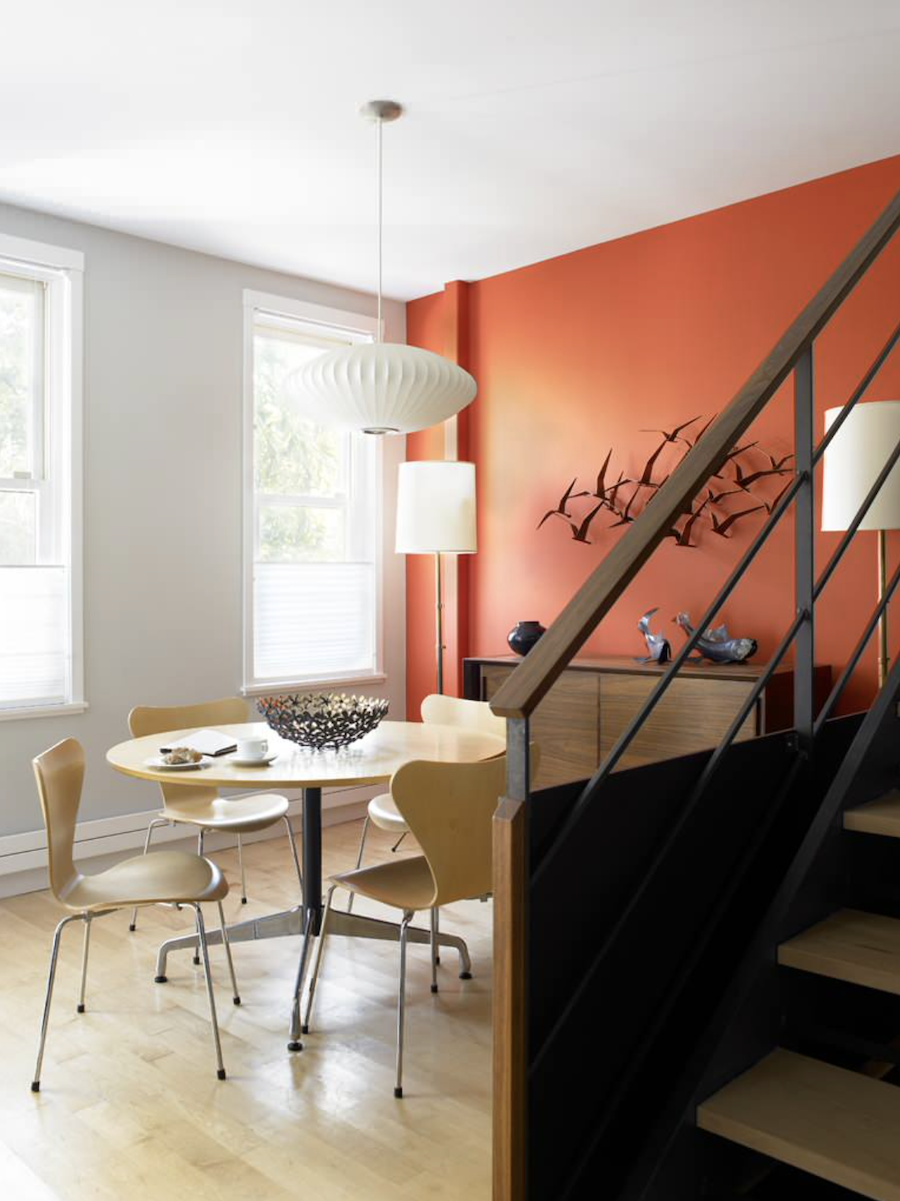
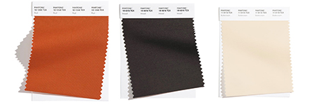
This dining room looks pristine and inviting all at the same time. The rust color on their accent wall helps to warm up the space and makes for a fun feature. Since there hasn’t been as much hosting going on this year as in years past, it makes for a great time to pick your favorite color off this list and refresh a room! This dining room got a major facelift when the beautiful rust color was added in.
Opposites Attract
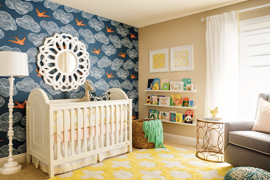
Did you know on a color wheel, the colors directly across from each other are actually classic pairings? It might seem like a stretch at first, but red and green, yellow and purple, and blue and orange are some of the prettiest combos out there. Just look at this nursery! This is an excellent example of how to get those opposite colors to attract and play well together to create a perfect look.

Which Colors Stand Out to You Most?
Are there a few color picks in this lineup that speak to you? How about a couple others that you may have never thought of but are now excited about? No matter which color trends you are eager to follow, California Window Fashions is here to help top of your newly designed rooms with any window treatment needs you have. Our solutions will meet you with both style and function and be the finishing touch each room needs. Contact us today for your FREE design consultation.


